■Spa Monopole, known for bottling the purest water in the world, is a trusted Belgian icon, renowned for its unmatched purity, derived from its all-natural filtration process. The task was to refresh the brand’s visual identity, packaging, and communication while preserving its core values and modernising its image.
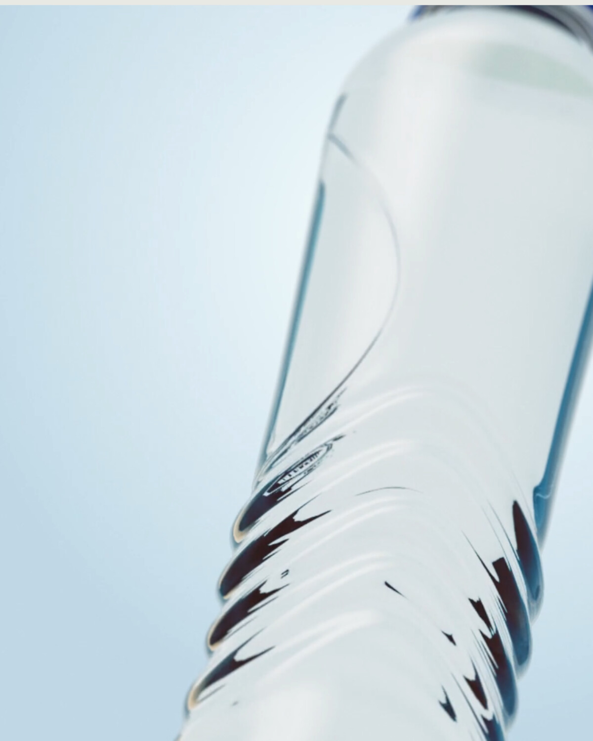
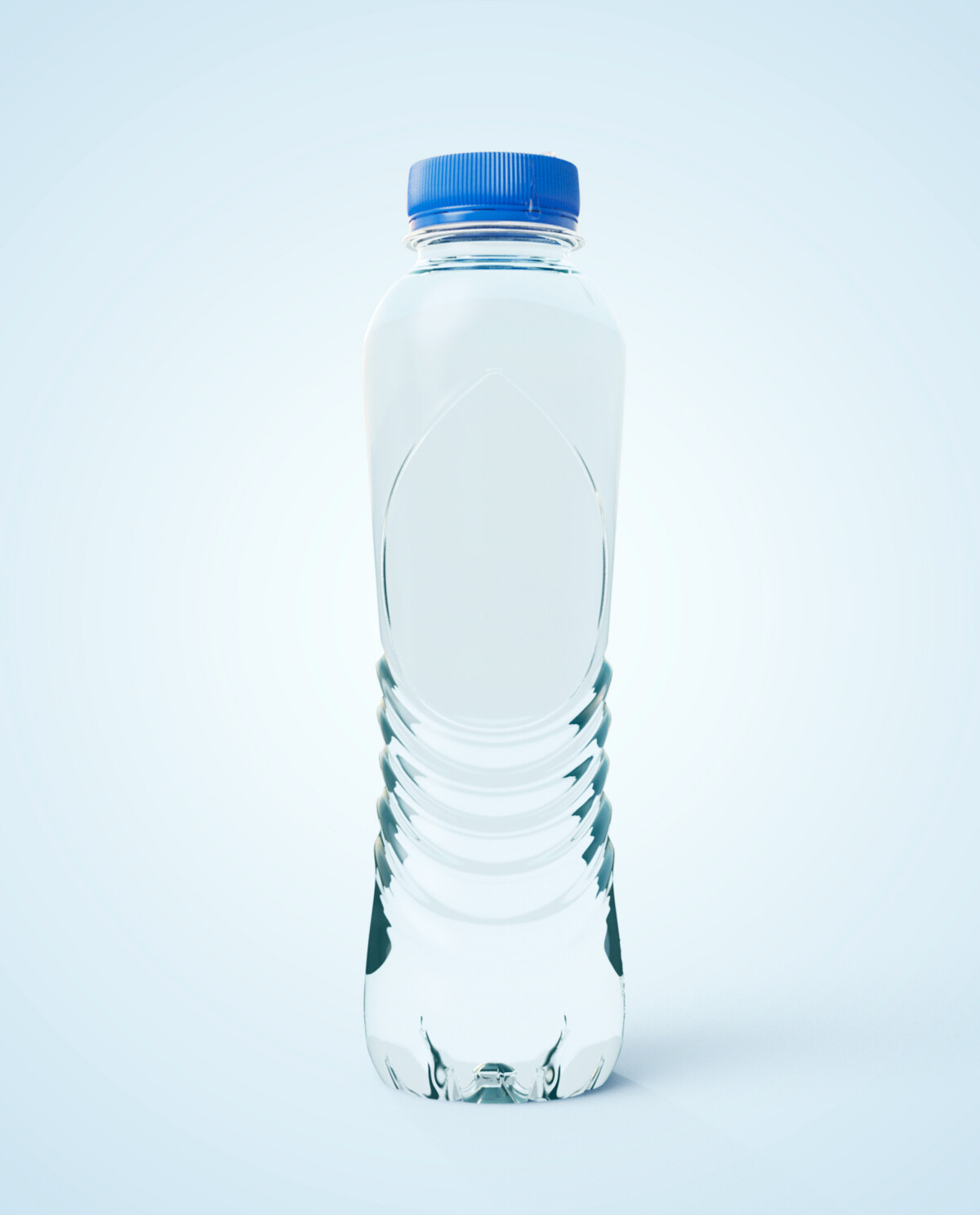
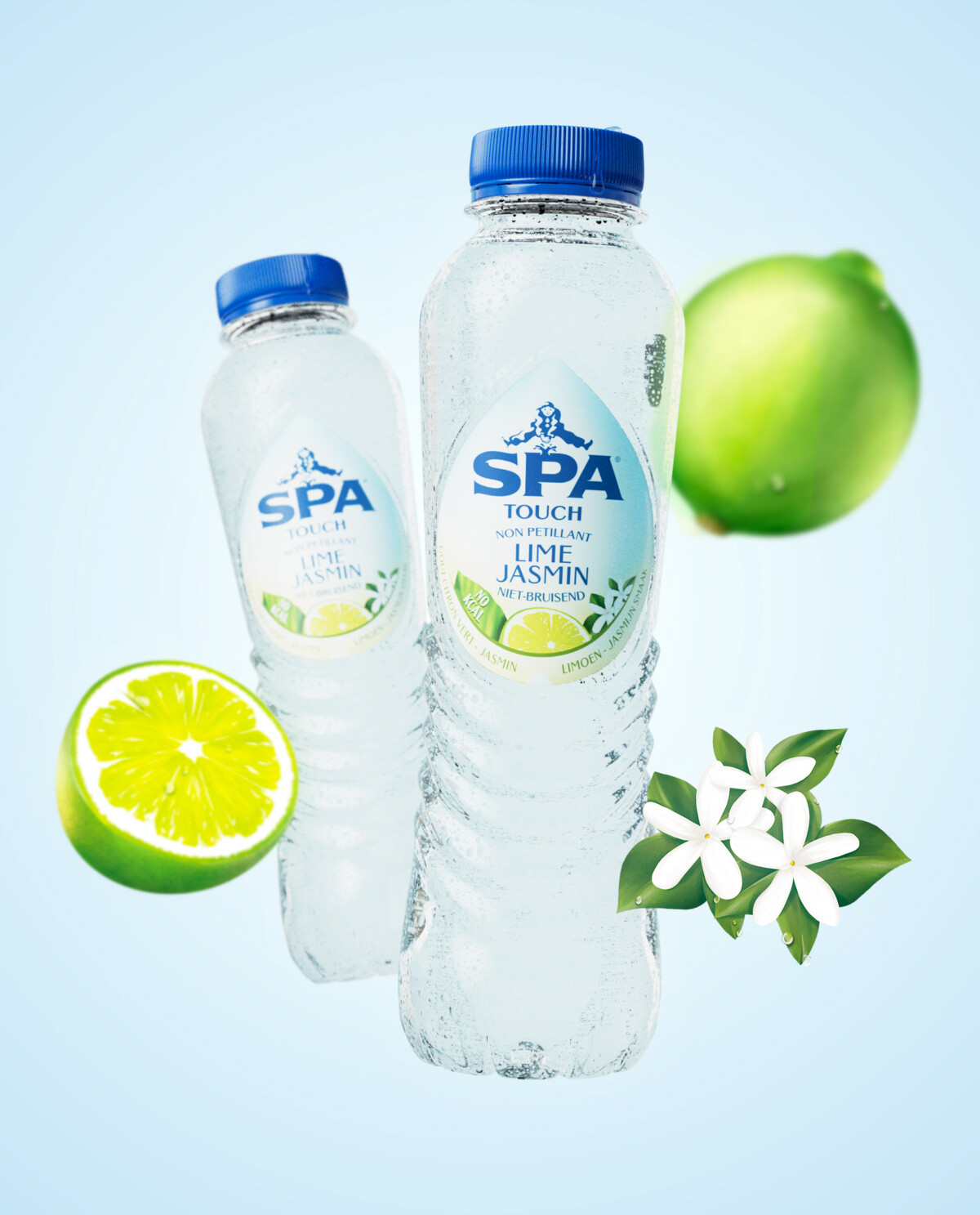
The packaging design blends contemporary heritage with hand-drawn illustrations, muted colours, and a modern Gothic typeface, updating the brand for the 21st century. The water drop became a key design element, creating a cohesive look across the entire product range—from SPA Fruit labels to the colour-coded lemonades. In-house illustrations further emphasise the brand’s natural appeal.
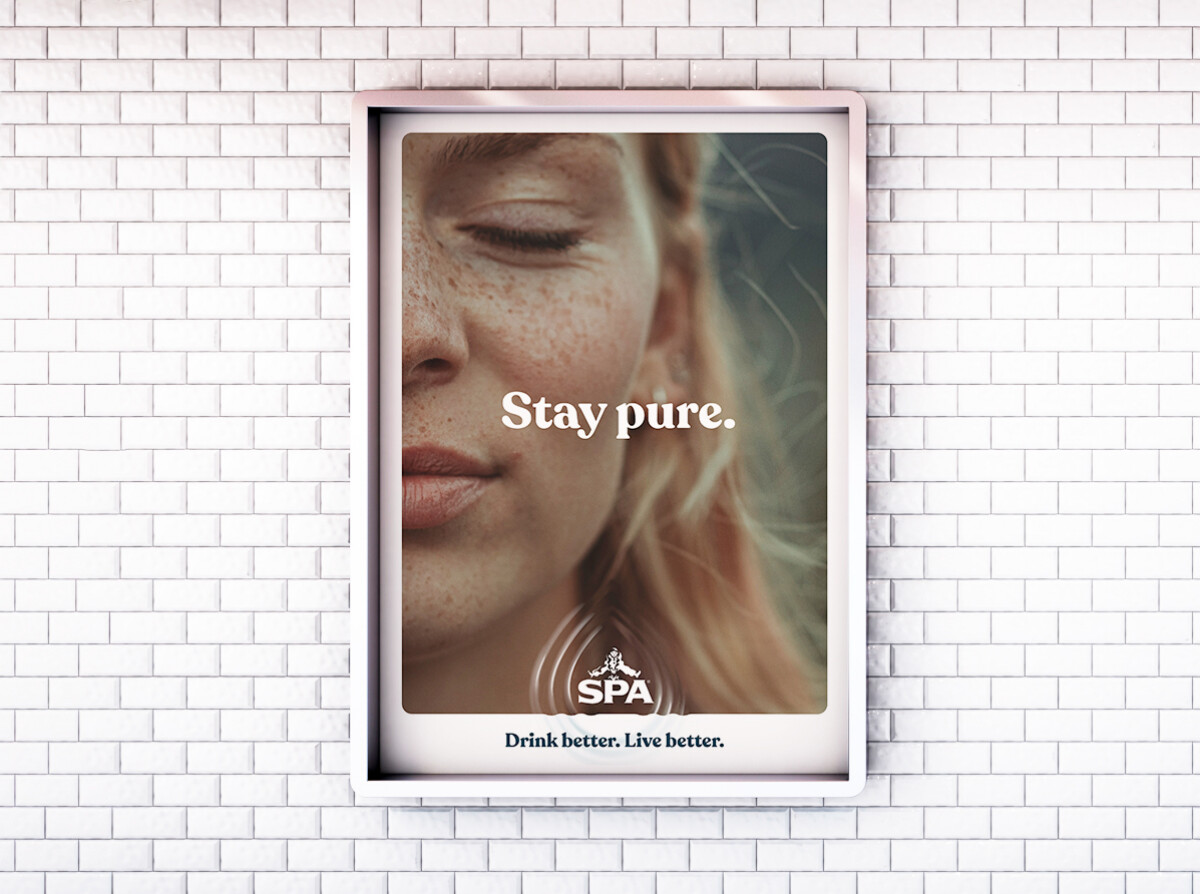
The new purpose, “Drink better. Live better,” was integrated into a 360° campaign that used the water drop as a consistent visual thread across all brand communications.


