■Let's grow, together!
In Belgium, hockey has experienced impressive growth, boosted by the results of the national teams. These achievements are no coincidence but the result of professionalization driven by the federations. On the eve of the 2026 World Cup, it was high time to embody this ambition through a new brand and an identity project.
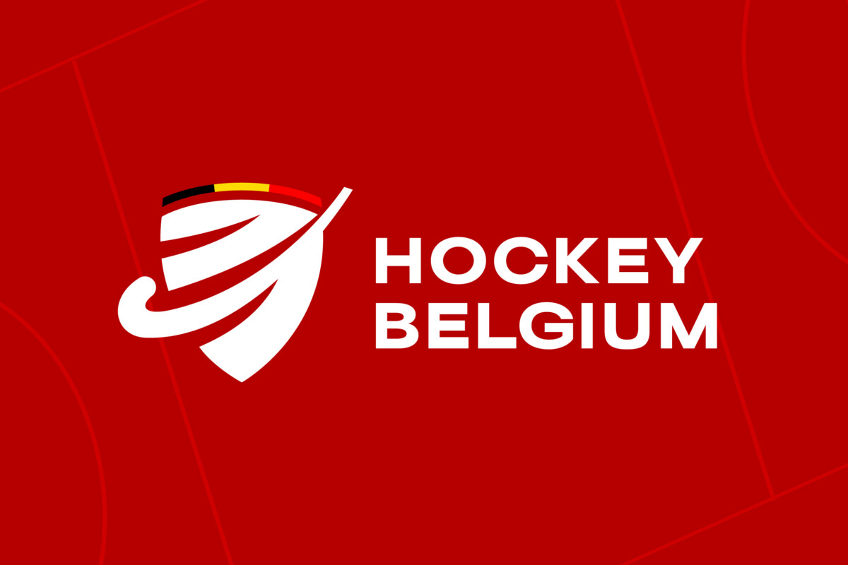
This is how Hockey Belgium was born: a unique, strong, and unifying brand, conceived as a national rallying point. It brings together the three leagues, now renamed Royal Belgian Hockey Association, Hockey Vlaanderen, and Hockey Wallonie Bruxelles.
This new structure is supported by a modernized visual identity, a clear brand architecture, and a complete design system, all carried by a unifying slogan: Let’s Grow Together, expressing the spirit of Belgian hockey and its philosophy of inclusion, progress and shared performance. A modern crest, a design system inspired by the pitch, and a sub-brand ecosystem strengthen the coherence and visibility of Belgian hockey
Impact: A strong and unifying identity to bring the three Belgian leagues under a single banner and embody the collective drive, passion, and ambition of a sport on the rise. Today, Hockey Belgium unites an entire sport that is organized and forward-looking.


